First Impressions: TCL Nxtpaper 14 Pro
An early look at the tablet that's good for your eyes
First Impressions
There’s one reason to pick the Nxtpaper 14 Pro over any other tablet, be it Android or iPadOS, and that’s the Nxtpaper 3.0 display.
Key Features
- Nxtpaper 3.0 displayBrighter matte display is wonderful to read on
Introduction
The struggle for Android tablets has always been trying to stand out in a crowded, slightly dull market – that doesn’t seem like an issue for the TCL Nxtpaper 14 Pro.
This is a big Android slate with one killer feature – a screen that’s designed to be easy on the eyes and a joy to read on.
I spent an extended period with the TCL Nxtpaper 14 Pro on the CES 2024 floor and here are my initial thoughts.
Price and Availability
TCL hasn’t confirmed pricing or a release date aside from ‘Early 2024’, however there will likely be more information in the run-up to MWC towards the end of February.
Design and Screen
- Nxtpaper 3.0 screen tech
- Standard Android tablet design
- Display easy on the eyes
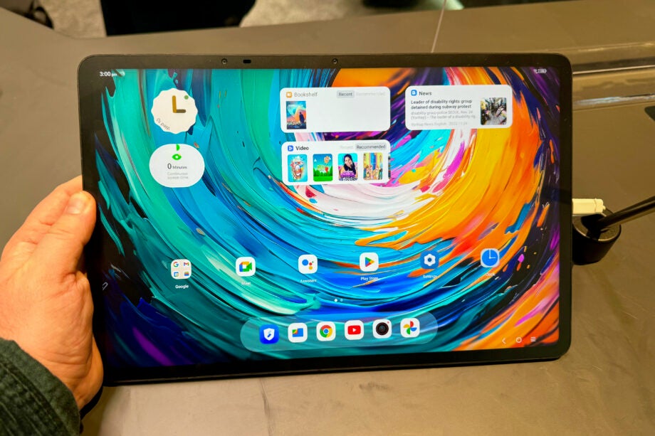
The Nxtpaper 14 Pro is a tablet focused on offering a different screen experience to the rest of the market. While some of the best Android tablets battle it out over HDR performance and resolution, TCL is instead more interested in making a tablet that’s great to read on and comfortable for the eyes.
The brand’s Nxtpaper tech isn’t new. It’s been on phones before, along with other Android tablets, but using it on a large 14-inch tablet is the smartest move yet and this is the best version of Nxtpaper I have used to date.
TCL says this matte screen tech filters out more blue light than traditional screens and Nxtpaper 3.0 ups the brightness levels by around 10% to roughly 700 nits, while adding in support for a faster 120Hz refresh rate and DC Dimming to reduce flicker.
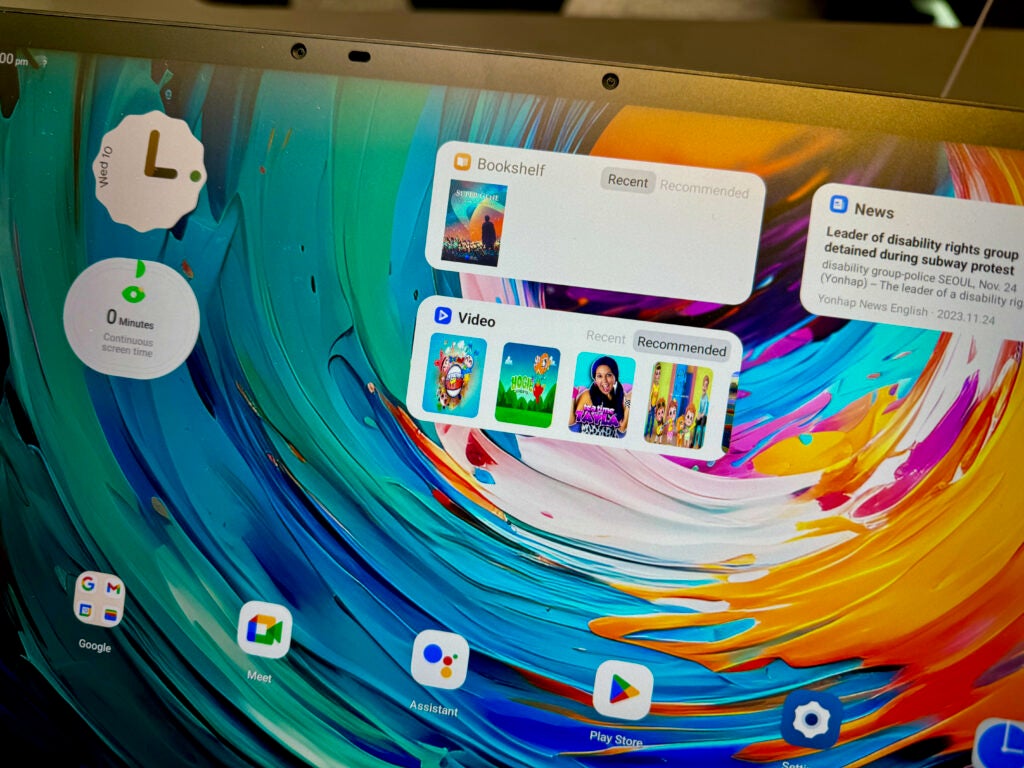
My favourite feature though is a new mode that switches the colour interface for a greyscale one that turns this tablet into something not far off a Kindle. The screen here isn’t e-ink, but it does a very good job of mimicking the benefits. I started reading a book during my demo and instantly the experience is better than any iPad.
Issues remain though, and they’re easy to spot even during a short demo. While the brightness levels have increased, the screen still looks a bit dim – especially compared to other higher-end Android tablets. On the CES show floor, I had to push the brightness level right to its maximum to be able to comfortably read the display, That’s not the best starting point.
It’s also not the best display for video, although that is typically the case with heavily matte screens. There punch of a glossy screen just isn’t there, and everything looks a little washed out and flat.
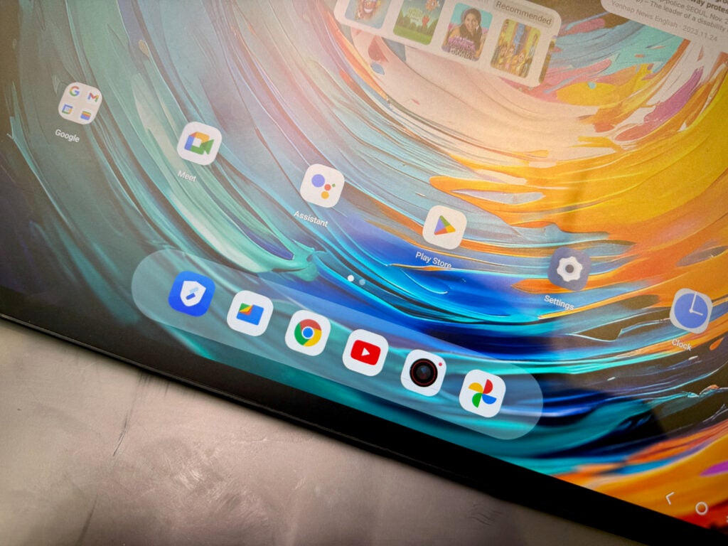
I have rarely found TCL’s mobile product good looking and the 14 Pro remains a dull tablet to look at. There’s a very large circular camera module on the back along with some pins for attaching accessories, while the sides are flat.
Performance
- Fast charging
- Capable MediaTek chip and 256GB storage
Once you move away from the screen tech, the rest of Nxtpaper 14 Pro is a lot more than what I would typically expect from an Android tablet.
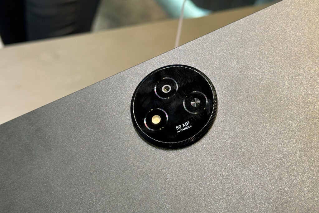
There’s a MediaTek Dimensity 8020 chipset, 12GB RAM and 256GB storage plus a 50MP camera on the back. 33w charging should get you from 0-100% quickly and there’s a stylus included too that works wonderfully with the Nxtpaper screen.
Early Verdict
There’s one reason to pick the Nxtpaper 14 Pro over any other tablet, be it Android or iPadOS, and that’s the Nxtpaper 3.0 display.
The 14-inch 2.8K panel is glorious for reading on and it feels a lot more like paper than glass when paired with the stylus. It’s a very clever unique feature that I want to use more of.
If you want a tablet for reading, rather than watching Netflix, this could very well be the best tablet for you.


