First Impressions: Philips 65OLED+908
A closer look at Philips flagship OLED for 2023


First Impressions
Philips’ flagship OLED for 2023 looks very appetizing with bright, punchy, and colourful HDR performance. We’ve not seen the full extent of its capabilities, though, but its Crystal Clear picture mode puts in a very handsome looking performance.
Availability
- UKTBC
- USAunavailable
- EuropeTBC
- Canadaunavailable
- Australiaunavailable
Key Features
- HDR supportHDR10, HLG, HDR10+ Adaptive, Dolby Vision
- Sound systemNew 3.1 sound system from Bowers & Wilkin
- New UIRedesigned interface and addition of Google TV
Introduction
Given a soft announcement earlier in 2023, the Philips OLED+908 now has the runway in sight, swooping in to land in online and brick & mortar shops in the run-up to Christmas.
And at Philips TV and Audio event in Barcelona I was given a more detailed overview and insight into what Philips is bringing to the market. The most notable feature is its brightness, but it’s not necessarily how bright you can get but what you do with that brightness that counts.
Design
- A refinement of the OLED+907
- Three sizes
- Central stand
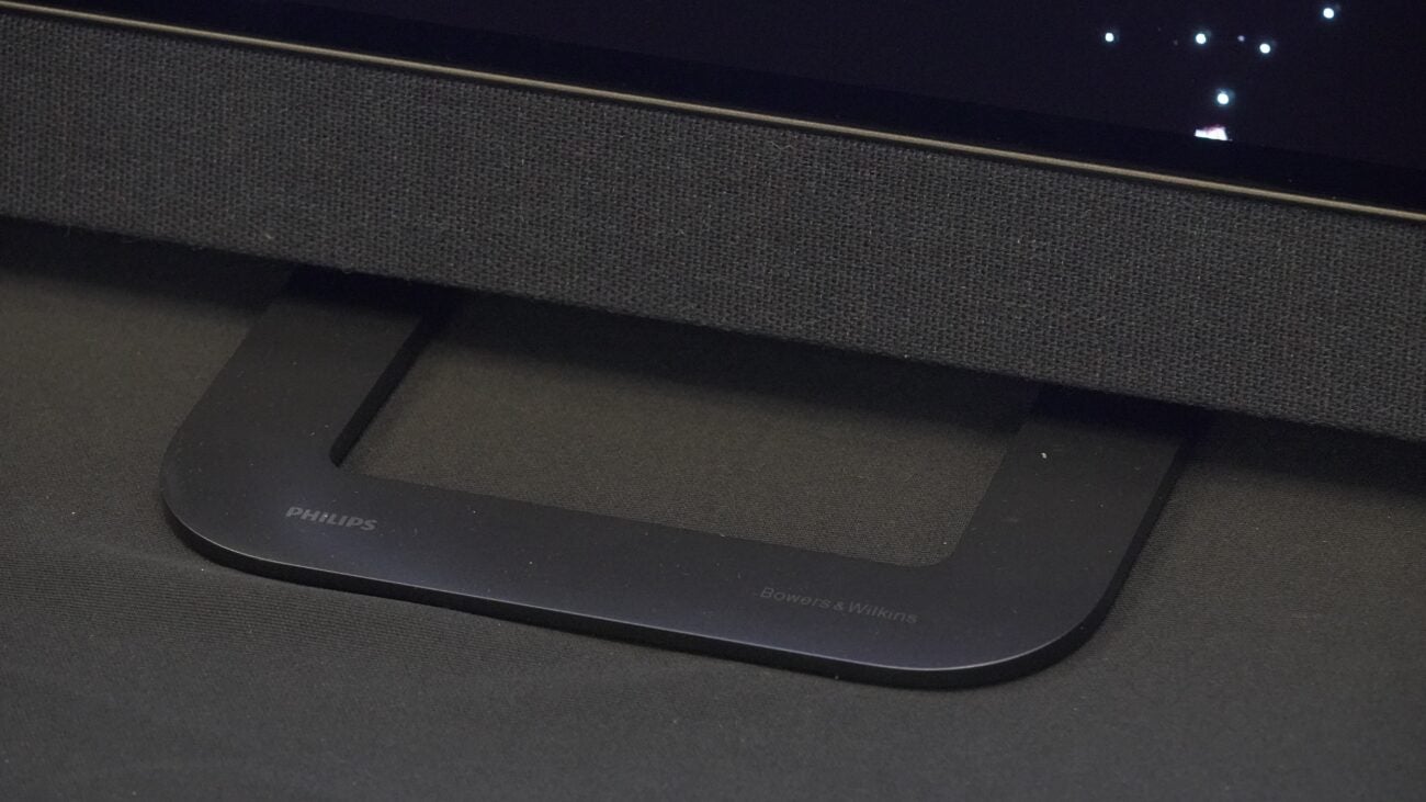
I’ll waste just a few words on the design as the OLED+908 is more a refinement of the five-star rated OLED+907 than a major move in a new direction. As you’d expect from a premium Philips TV, it’s design is reflective of high quality craftmanship, from the minimal edge bezel design to the integrated sound system from Bowers & Wilkins that’s decked in acoustically treated Kvadrat cloth.
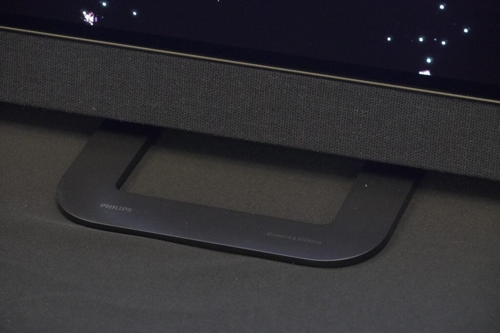
Round the rear of there’s the three-sided Ambilight ring that surrounds the section that houses the connections and the integrated subwoofer. That stand it comes with occupies a small footprint in front of the TV (slightly bigger from behind) but it should allow for the OLED+908 to be parked o a relatively small plot of AV furniture, depending on the size, of course. And the OLED+908 comes in 55-, 65- and 77-inch sizes, matching the LG G3 OLED.
Features
- Google TV support
- Redesigned remote control
- New look menu
Features weren’t the main focus of the demonstration I saw, but I do know that the OLED+908 is heading to market with Google TV. After speaking to Sharp at IFA 23, it sounds as if progress has been made in the impasse between Freeview and Google over Freeview Play integration.
It’s also set up to be a gaming powerhouse too, with 4K/120Hz, VRR (HDMI VRR, AMD FreeSync, Nvidia G-Sync), ALLM, and Dolby Vision Game mode included. No word on the input lag but based on previous models expect it to be around the 15-20ms area.
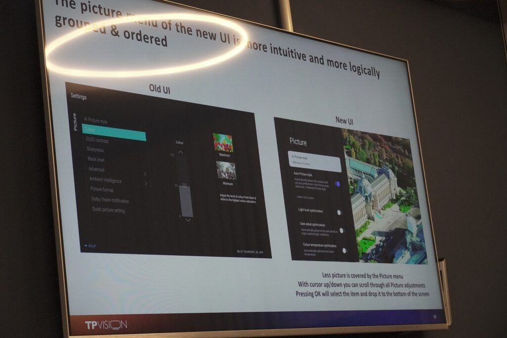
Philips has (finally) reduced the footprint of its menu screens with a less overbearing presence. Rather than occupying the whole screen, it’ll take up half of it with the main menu overlays, and when you want to edit a setting, it’ll pop up as a strip in the bottom half. Much more sensible.
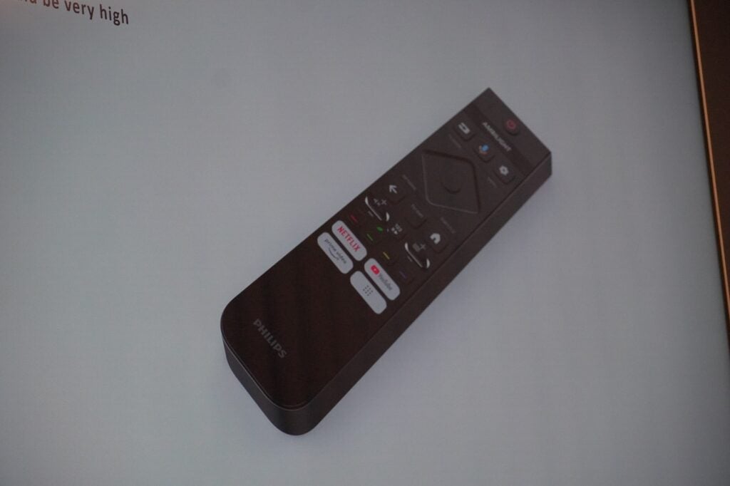
The remote has been redesigned to be both easier to use and environmentally friendly. It’s rechargeable via USB-C and if memory serves it takes three months for the battery to run down. It’s added a backlight to highlight certain buttons that are activated by motion. And despite the redesign of the navigation block, it’s retained the number pad that appears as if by magic with the press of a button. Unfortunately, I didn’t take a picture of the actual remote, but here’s a picture of it on a presentation.
Picture Quality
- High peak brightness Micro Lens Array panel
- Bright, but balanced images
- Slick motion processing
- Ant-Glare Vanta Black screen
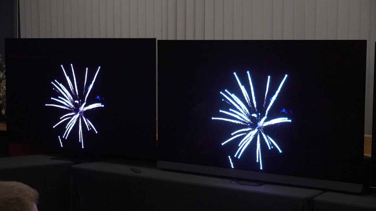
There’s a caveat to this section as the Philips OLED+908 was only presented in its Vivid mode equivalent (Crystal Clear) and demoed with the Samsung S95C and LG G3 OLED in their respective Dynamic/Vivid modes.
I understand the reason behind this. ‘Vivid’ sees the TV performing at its highest capabilities in terms of peak brightness, but ‘Vivid’ modes aren’t necessarily the same for each brand (for Samsung it’s essentially their shop floor mode). Understandably, if you’re going to have a Vivid mode in someone’s actual home, it can’t just literally be for show. It has to bring the performance, too.
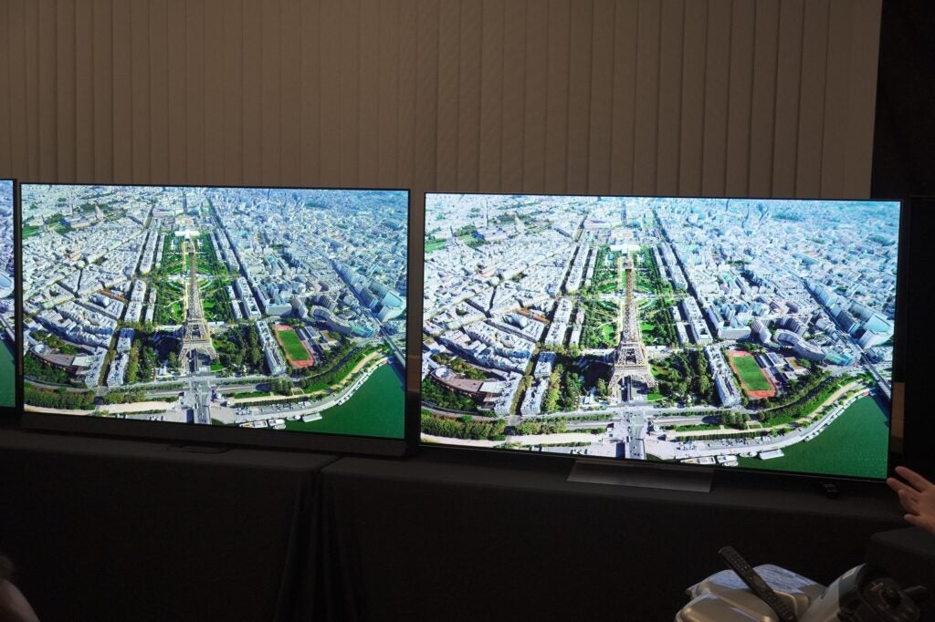
And that’s what Philips’ Crystal Clear is tooled for: performance, and it does impress compared to the Samsung and LG. A note is that the OLED+908 uses the same Micro Lens Array panel as the G3, so the performance ceiling is the same, it’s the processing that’ll bring out the differences.
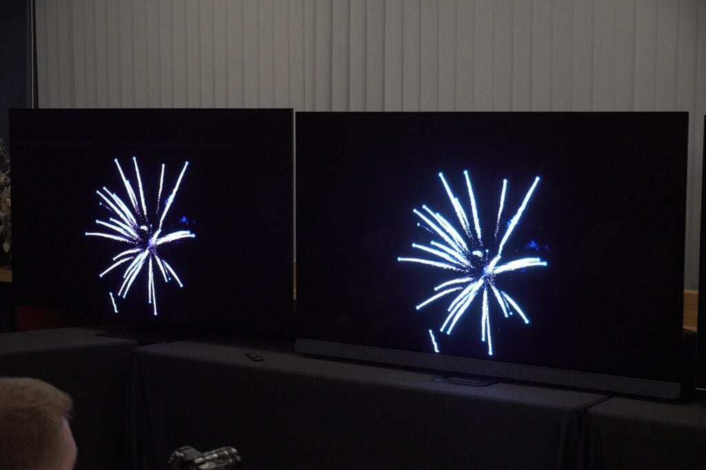
And those differences relate to contrast, brightness, and colour balance. Like the Sony A95L, Philips has taken a more nuanced approach with its Vivid mode. It’s not an array of gaudy colours as it is on the S95C. Skin tones are more representative of how they should appear and not pumped as they look on the G3 OLED. The brightness is convincingly intense, highlights from a firework show burn with a white hot intensity and sharpness that makes the S95C dimmer (and duller) by comparison.
But the image isn’t a wash out with blinding brightness – the wrinkles and patterns in a linen cloth is revealed with more detail and definition thanks to the 7th Gen P5 AI processor. It’s an image that’s very bright but also retains detail, whereas LG’s Vivid mode conceals the fine detail with its processing.
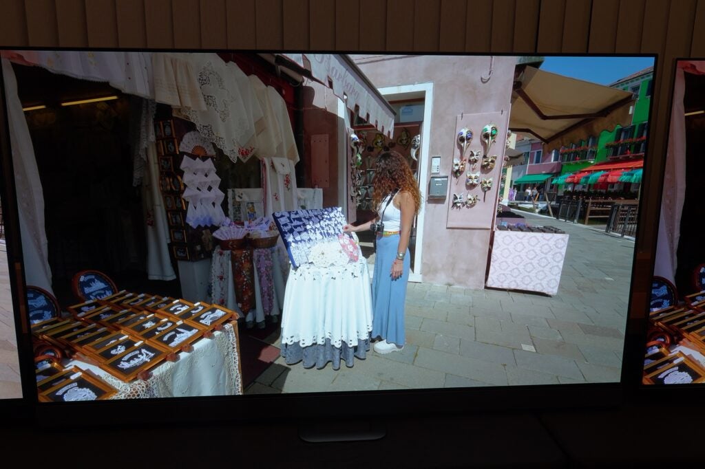
Colours are slightly wider-ranging, primary colours are offered with more nuance and punch (stronger, brighter blues, punchy reds). Contrast is expressed better, the rooftops of a city hit a distinctly blacker tone than either the Samsung or LG can muster. Motion processing is smoother and slicker, with less glaring artefacts than the LG (which looks all at sea).
The Vanta Black polarizer integrated into the panel also reduces reflections with its anti-glare properties. You’re less likely to see yourself in the screen in darker scenes.
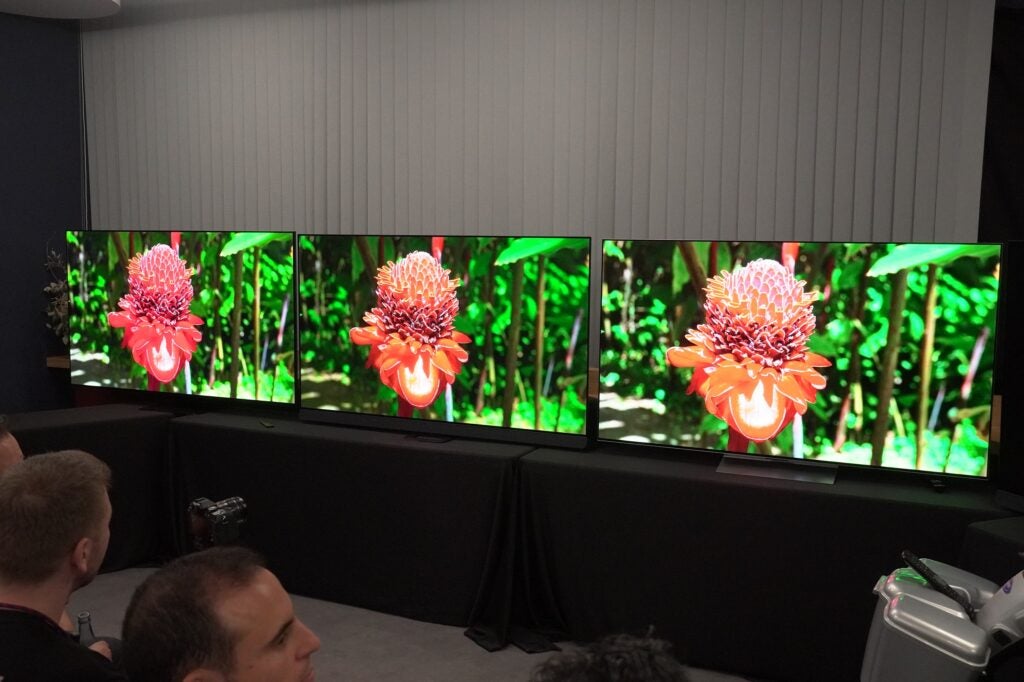
The caveat remains that Crystal Clear (Vivid) mode won’t be the mode most instantly turn to, so the comparison doesn’t feel quite as merited. Of course, Filmmaker mode modes turn off processing, so in theory there shouldn’t be any difference in their respective picture modes (I wasn’t shown this).
Sound Quality
- Dolby Atmos virtualiser
- 3.1 channels
- Seven audio modes
I wasn’t given a demonstration of the Bowers & Wilkins sound system, but the essential facts are it is a 3.1 channel system with a left, centre, right configuration, supported by a woofer and support act of four passive radiators to provide the low end thump.
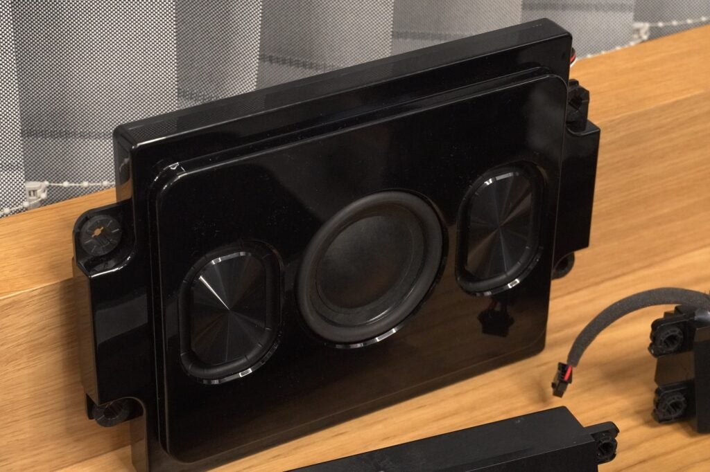
Bowers has tuned each sound mode (there are seven: AI, Entertainment, Original, Music, Spatial Music, Dialogue, and Personal (custom)); and it has tuned the sound system for each screen size too.
With a total of 80W of power at its disposal and a Dolby Atmos virtualiser, the OLED+908’s audio system sounds promising, but I haven’t heard how it sounds yet.
First impressions
First impressions of the Philips are positive but with caveats in that I’ve only been shown what Philips wants me to see.
Nevertheless, the performance is encouraging as the Philips OLED+908 is a TV you would want to watch in its Vivid/Clear mode. Its balanced picture, natural colours, and stunningly bright contrast and highlights make for a very attractive picture. I’ll have to wait and see whether it’s the complete package when review samples start rolling in.


