Onyx Boox Air 3 C Review
A colourful alternative to the Kindle Scribe and ReMarkable 2 with comparatively poor battery life


Verdict
An E Ink tablet that is a more open, and pretty compelling, alternative to the Kindle Scribe and ReMarkable tablets. That openness comes with compromises in battery life and ease of use, though, and it’s important not to expect too much from the colour screen.
Pros
- Has a sharp colour E-Ink screen
- Good subscription-free note-taking skills
- Supports Android apps from Google Play
Cons
- Low display saturation and contrast
- Pricey
- Poor battery life by e-reader standards
Key Features
- Colour E Ink screenThe lead lure for long-term e-reader fans is a colour E Ink screen seen as a holy grail for some.
- Google Play supportThis tablet has its own core software, but it can be augmented with downloads from Google Play.
- Up to 11-hour battery lifeDon’t comes expecting weeks of battery life as our testing suggests if you read roughly a page a minute around 11 hours is the maximum.
Introduction
The Onyx Boox Air 3 C is a big colour-screen e-reader and note-taking tablet. If you have dreamed of a large colour Amazon Kindle for years, this is about as close as you will get.
It’s much more too. Behind a simple reader interface the Onyx Boox Air 3 C runs Android, and has the Google Play app store built-in.
You can stream video or play games on the Onyx Boox Air 3 C. You probably shouldn’t, but app access opens up ways to do things the tablet will, or at least could, be good at.
Price is the main hurdle here. At £499, the Air 3 is more expensive than the Kindle Scribe or Remarkable 2. But at least it costs less than the Boox Tab Ultra C.
You need to come with the right display expectations too. The colour depth of colour E-Ink screens like this one is poor, and thanks to its more complex architecture, contrast is lower than that of the competition.
If you hope for this to be the ultimate graphic novel reader, you may be disappointed. Battery life is also quite poor in plenty of situations. Complaints, I have a few, but the Boox Air 3 C is the sort of device we should be glad exists.
Design
- Very slim
- Large frame
- Good build quality
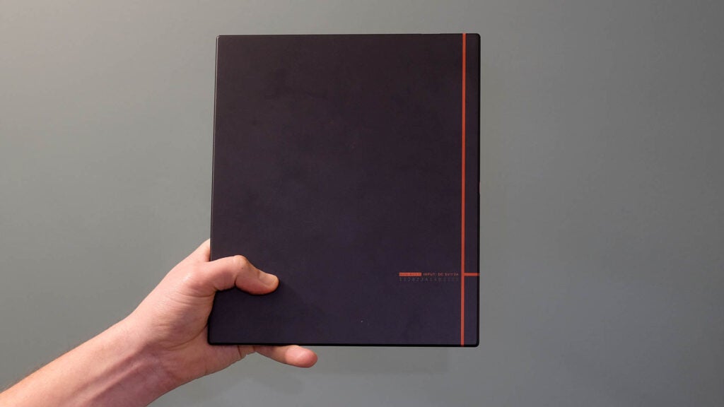
The Onyx Boox Air 3 C looks and feels great, especially given Onyx may well be a brand of which you have never heard. It’s a thin 5.3mm-thick slab of aluminium.
Its size means this feels more like the scale of a mid-size tablet than a traditional e-reader. While I have used the Onyx Boox Air 3 C to read in bed a bit, my trusty Kindle Voyage feels made for the job more than this Boox.
That said, there is a big blank spot on one side to leave plenty of grip space for a thumb.

The Onyx Boox Air 3 C weighs 430g. It’s a bit heavy to hold for hours one-handed, but is no heavier than a tablet of this scale. I was instantly worried I would scratch the Air 3, in part because has such an expensive-feeling finish. That counts for the screen too, which has a plastic finish, not glass like the Kindle Oasis (and ancient Kindle Voyage).
A case is recommended. Boox makes one. I have it. It hooks onto the metal back using magnets, and appears to be included when you buy direct from Boox.
A lot of the other external features are typical of an Android tablet. The power button doubles as a fingerprint reader, a pretty handy feature given a Boox might be loaded with documents you don’t want anyone and everyone to be able to see.
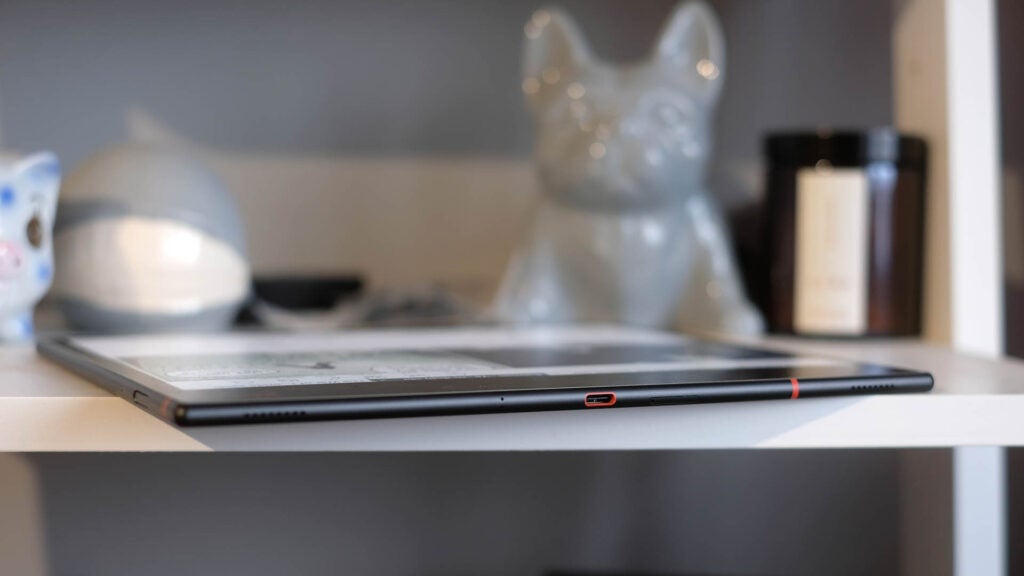
On one side sits a microSD slot for expandable memory, although the 64GB storage goes a long way when storing notes and ebooks. The power button also doubles as a fingerprint reader, for secure unlocking.
It also has stereo speakers. These are quite weak-sounding by the standards of modern tablets and, strangely enough, there are no volume controls on the Air 3 itself. You have to alter the level through the software interface. However, it’s clear that audio is a periphery feature here at best.
Screen
- Colour E-Ink, but limited contrast and saturation
- Good sharpness leads to clean-looking fonts
- Pressure sensitive stylus
The 10.3-inch screen of the Onyx Boox Air 3 C is its killer feature and a source of disappointment if you don’t arrive with sensible expectations. This is a Kaleido 3 Carta 1200 display, a colour E Ink screen.
I was dead keen on these things becoming commonplace more than a decade ago, and remember seeing prototypes of such tech many years ago. That never happened. Kindles are still black and white.
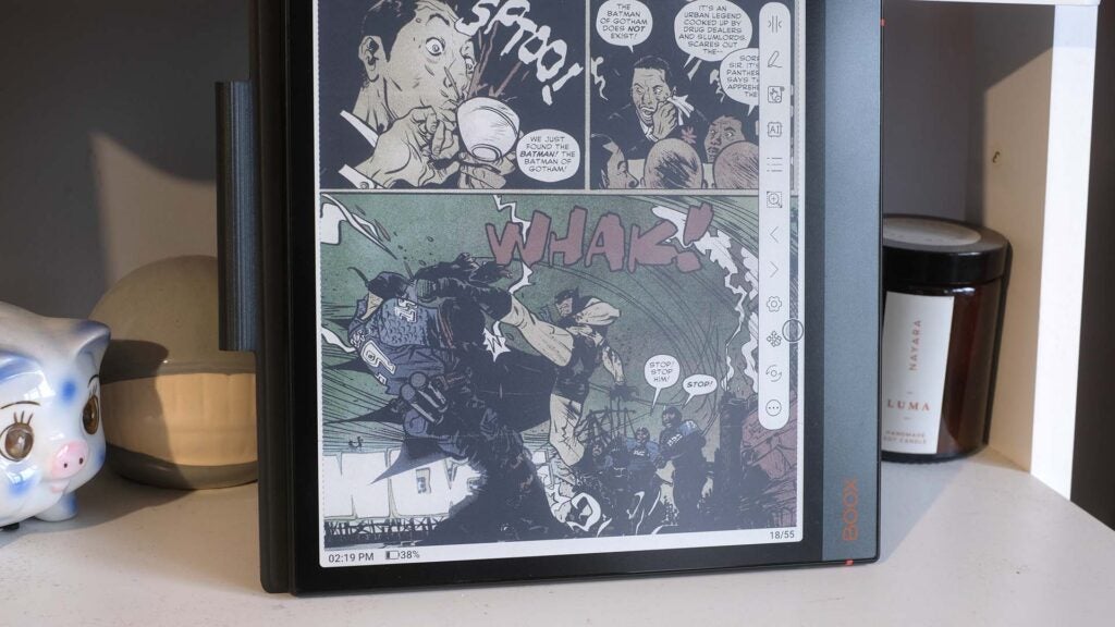
That the Onyx Boox Air 3 C exists is simultaneously awesome and proof of why these things are quite rare. For starters, it actually has different colour and B&W resolutions. It’s 2480 x 1860 pixels for monochrome, 1240 x 930 for colour — half the resolution.
The Onyx Boox Air 3 C still uses a fairly conventional Carta 1200 E Ink panel at its core, but there’s a colour filter array (CFA) on top of that. It’s capable of relaying 4096 colours, compared to the 16.7 million of the average phone.
This means you see clear delineations between tones in gradients at times. But it’s the limited saturation and colour depth you’ll notice most. Do not buy an Air 3 expecting rich or bold colour. It’s extremely sallow.
And using a colour filter reduces reflected light, making the display look less vital than a plain monochrome e-reader. Contrast is lower, whites look greyer. This pretty much mandates the use of the display light in most conditions, which in turn reduces the already limited black depth. And the backlight on my old Kindle Voyage is significantly brighter than this one.
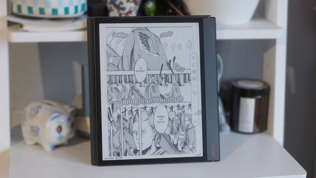
Colour E-ink is an almighty tech headache, clearly. However, among e-readers, the Onyx Boox Air 3 C looks great. It’s very sharp. And if you adjust your expectations to the right level, the colour can be useful. Despite all the complaints, I enjoy reading graphics novels on this thing, and you feel like you’re missing out much less when reading comics in colour — compared to doing so on a Kindle.
If better colour is a must, look for a Gallery 3 e-reader like the Bigme Galy. But it’s not widely available, costs even more and has its own set of problems.
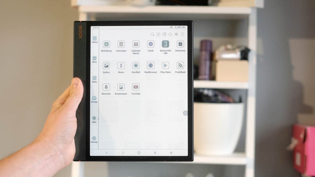
The Onyx Boox Air 3 C also supports a stylus, and it’s not just a simple pen. It supports 4,096-level pressure sensitivity, just like the Samsung S-Pen or Apple Pencil. This is arguably where the tablet’s support for diverse Android apps is most welcome — you can use enthusiast art apps like Sketchbook with the Onyx Boox Air 3 C. The stylus is not just for note-taking and annotating PDFs. But, of course, you can do that too.
The screen surface is made for more satisfying stylus use, with a textured surface that feels closer to paper than smooth glossy glass.
Boox also offers a great level of control over the refresh behaviour of the E-Ink screen. These displays use tiny white and black capsules that are brought to the surface to create an image, and it leads to a sort of ghosting of previous screen content until the display is fully refreshed, resetting it to an “all-white” screen
The Onyx Boox Air 3 C has five modes that alter how regularly this refresh happens, and even more controls underneath those. More regular refreshes reduce the ghosting effect, but reduce the smoothness of on-screen motion.
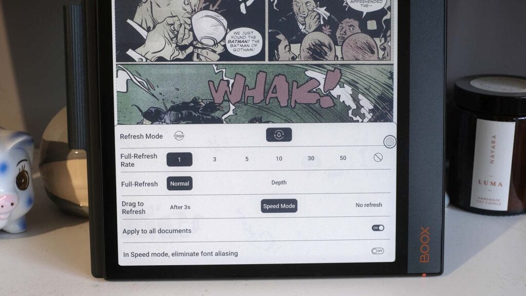
It will probably take you a while to get your head around all the screen refresh controls, but this depth of control is important in a tablet with a more diverse set of abilities than a Kindle. The Boox also stores your chosen mode and setting for each specific app, which is fab.
There are a couple of additional issues to bear in mind. I find the Onyx Boox Air 3 C suffers from ghosting more than other E Ink devices I’ve used recently. Even after a full-screen refresh, you can often see slight afterimages — I’ve noticed this more in novels than comics/graphic novels.
This e-reader’s front light also has colour temperature control. You can make it appear more blueish, or reduce the blue light content and make it an orange shade. There’s a free-motion slider that lets you achieve the tone you want.
Software
- Good built-in note-taking app
- Supports Android apps and has Google Play app store
- Some Android apps will feel sluggish
The Onyx Boox Air 3 C software is one of its greatest strengths, and also the root of some of its fundamental problems. This is an Android device with a custom software layer on top.
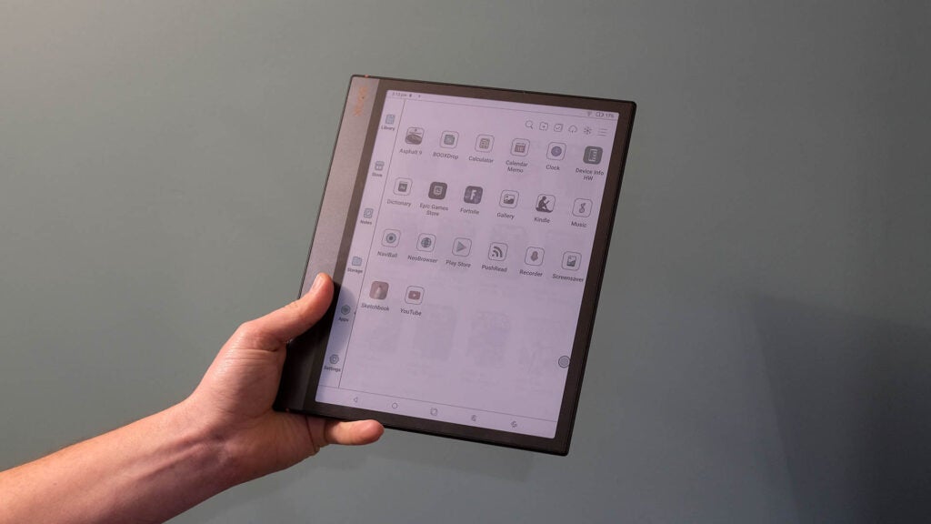
That software veneer offers the core features a device like this needs. There’s a simple Reader app, which can handle all sorts of documents including CBR/CBZ comic book files, EPUBs and PDFs.
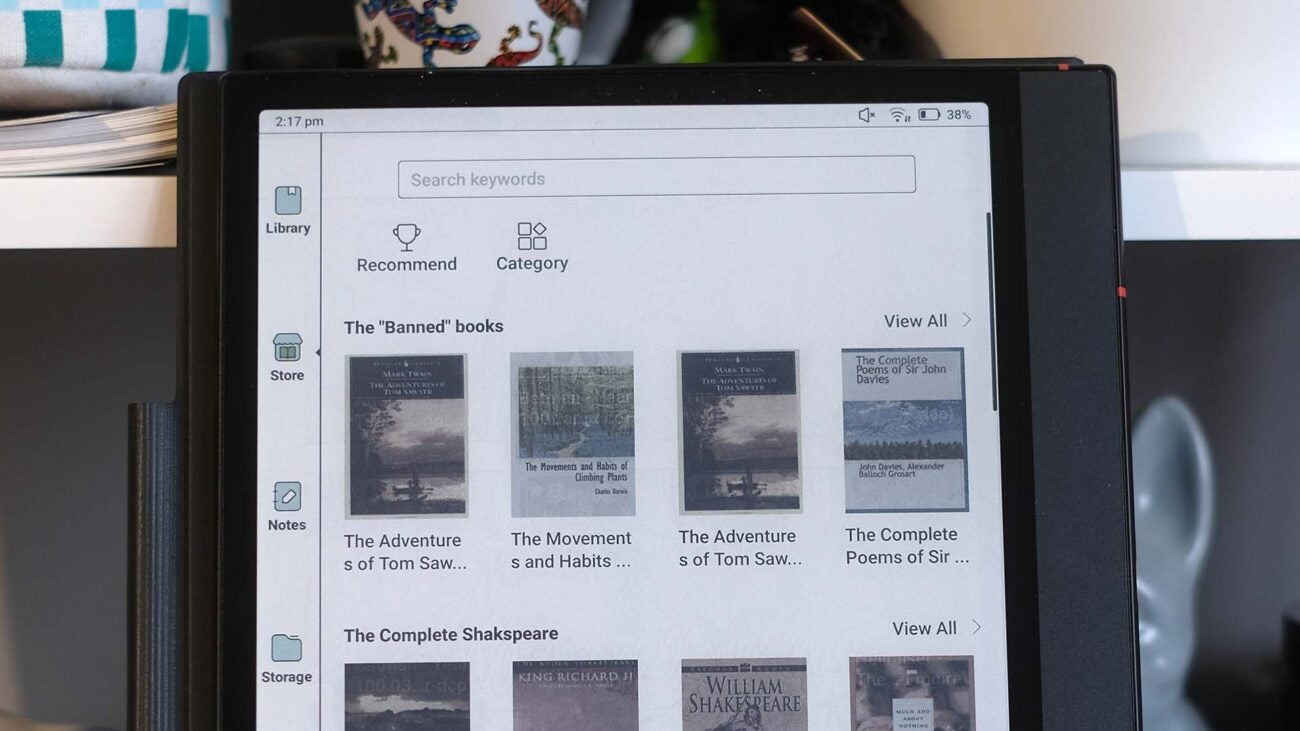
There’s a “store” section, where you can download public domain works like HG Wells’s The War of the Worlds.
The Notes app is great, and comprehensive. There are all sorts of templates, grids and lined templates you can use for your notes, and it supports layers for non-destructive editing. Templates go beyond the basics, including stuff like a monthly plan, flow charts and musical scoring.
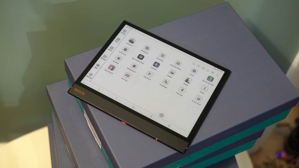
Nowhere does the stylus feel more responsive than in the Notes app too. There’s no real sense of the pen line lagging significantly behind the nib, which is definitely a factor when using a third-party Android art app like Sketchbook. While you may think of these E Ink screens as slow, according to a spec scraper app, the Onyx Boox Air 3 C has a 38Hz maximum refresh rate — low by the standards of phones, but high enough for natural-looking motion.
The app can use OCR (optical character recognition) to process your scrawls, but stops short of being able to work musical notation into a digital MIDI file, which is a shame.
You need an Onyx account if you want to cloud-store your notes, but a free sign-up nets you 10GB of storage. Unlike a Remarkable 2, a paid ongoing sub isn’t a thing here.
What’s missing? A good book store. However, that’s not a deal-breaking problem when Google Play is onboard. You can install Kindle, Kobo, Borrowbox or Overdrive.

I initially found the animated page turns of the made-for-mobile Kindle app distracting, and a magnet for ghosty smears in the E-Ink panel. However, a quick switch to the Regal screen refresh mode effectively fixed that, masking the animation.
The Onyx Boox Air 3 C has a Snapdragon 680 under the hood, making it dramatically more powerful than a Kindle Scribe or Remarkable 2. But it needs that power because of its more demanding operating system.
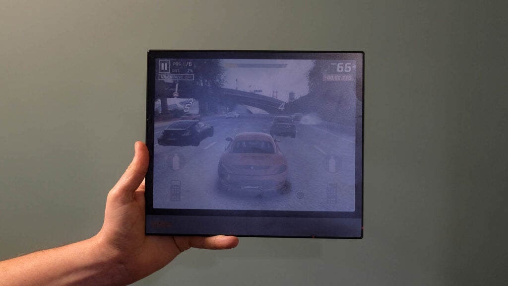
Here, you can play games like Asphalt 9 or Fortnite if you really want. I tried both. They work but don’t look or feel great, thanks to the low screen refresh and less-than-ideal frame rates. Fortnite runs terribly. I can imagine more visually simple puzzle games being a blast on the Onyx Boox Air 3 C, though.
If you’re keen on getting more power, perhaps to use this as an E Ink PC, you should also consider the Onyx Boox Tab Ultra C Pro. It costs more and has a Snapdragon 855 CPU — an oldie, but it’s a lot more powerful than the Air 3 C’s Snapdragon 680.
Battery life
- Short battery life by both e-reader and tablet standards
- Charges via USB-C
Long battery life is one of the key selling points of a rival Amazon Kindle e-reader. It’s measured in weeks rather than hours. The more open software of the Onyx Boox Air 3 C lets us judge battery life in multiple ways, but in no situation does it get close to that benchmark.
It has a 4300mAh cell, which is small for a phone, let alone a tablet. When playing video from YouTube, the Air 3 C lost 40% charge in 130 minutes, suggesting total playback time of around five hours 20 minutes.
On switching to the “HD” screen mode, which forces a screen refresh every time there’s significant change in the image, it lost 13% in 32 minutes. This suggests the more regular screen refresh can bring battery life down to around four hours.
Pretty bad right? When reading, the situation improves because of how the screen tech works, consuming little battery when on-screen content does not change.
Without using any strategies to try to squeeze the most out of the battery, the Onyx Boox Air 3 C lasts around six hours 40 minutes when reading. I then tested again, after turning off Wi-Fi and the display light, and saw the tablet can last around 11 hours.
Turning off Wi-Fi is advisable, then, but I do think you’ll want to keep the display light on as it improves legibility significantly when in less bright environments. But, yep, it’s pretty poor stamina compared with a Kindle Scribe.
Latest deals
Should you buy it?
You want a more open note-taking tablet
A colour screen and Google Play app support let the Boox handle jobs and content the Remarkable 2 and Kindle Scribe aren’t that well suited to.
You aren’t a tech explorer
The experience is less smooth here than the key rivals, the display has significantly less contrasty pop and if the price seems too high for you then then, hey, maybe it is.
Final Thoughts
The Onyx Boox Air 3 C is a surprisingly versatile and open-feeling reader and note-taking tablet. It feels more open and tinkerer-friendly than a Kindle Scribe or ReMarkable 2 tablet.
And adding a colour screen option here? That’s ambitious stuff, and a dream for some long-term reader fans.
However, it is also less approachable than a Remarkable or Kindle Scribe, and harder to recommend to many as a result. The battery life is relatively poor, and some of you will need to adjust your expectations of what a colour e-reader can, or should, look like.
While colour is excellent for reading comics or illustrated books, saturation is poor and the general display punch and contrast is lower than that of a standard e-reader. Still, it’s a tinkerer’s delight, and one I’m glad exists.
How we test
We test every e-reader we review thoroughly. We use the device over the review period. We’ll always tell you what we find and we never, ever, accept money to review a product.
Tested over two weeks
Compared against similar devices
FAQs
This tablet has no stated water resistance, so use it carefully when near liquids.
This is the colour version of the e-reader, while the B&W version is called the Boox Air 3.
There’s no headphone jack, but there are internal speakers and you can connect wireless headphones.


