Nothing Phone (1) Review
A good start, but nothing too special


Verdict
The Nothing Phone (1) is a good mid-range Android phone that fails to really stand out from the crowded market unless you’re a big fan of the transparent look.
Pros
- A design that stands out
- Really nice 120Hz OLED display
- Plenty of phone for the money
Cons
- Glyph Interface is more of a gimmick than a useful feature
- Odd performance issues, especally with the camera
Availability
- UKRRP: £399
- USAunavailable
- EuropeRRP: €469
- Canadaunavailable
- Australiaunavailable
Key Features
- Unique LED arrangement on rear panelThis phone has an eye-catching system of lights on its rear that can indicate incoming calls or the charging level
- 6.55-inch OLED displayThe large screen boasts HDR10+ support, 10-bit colour and an adaptive 120Hz refresh rate
- 33W fast-chargingNothing claims you can get 50% power in 30 minutes when charging wirelessly, and you can also use wireless or reverse wireless charging to top up the device
Introduction
The Nothing Phone (1) is the first Android phone and second product after the Nothing Ear (1) from OnePlus co-founder Carl Pei’s hyped startup.
Nothing focussed on building hype ahead of its Phone (1) launch. It’s a brand that whipped up a frenzy of support on Twitter and sold an unreleased phone on a site more commonly known for sneakers. This may sound exciting, but if you followed OnePlus before it became an obvious Oppo offshoot, the story of Nothing will be achingly familiar.
But a phone is a tough proposition and hype alone isn’t enough. With so much competition on the market and big names like LG extracting themselves from the crowded marketplace dominated by the likes of Apple, Samsung and Xiaomi; Nothing could have a tricky road ahead if it wants to become a brand name people know.
It’s worth noting that, despite the fact that the Nothing Phone (2) is now available, the original Nothing Phone (1) remains an affordable £399/$390 option for those that love the look – especially considering the Phone (2) costs an increased £579/$599.
Design and Screen
- 120Hz display at this price is always good to see
- Glyph lighting system seems like a neat, if limited, addition
- Overall look reminiscent of the iPhone 13
Standing out is hard for a smartphone. A decade ago we had variety in terms of design, but now just about everything – aside from pricey foldables that are out of reach for most buyers – is a rounded-off rectangle.
Nothing isn’t rewriting the rulebook when it comes to the Phone (1)’s blueprint, but it is trying to differentiate itself with a striking design.
Like the Nintendo Gameboys of my childhood, the Nothing Phone (1) has a clear back that lets you gaze inside the phone and see the snaking cables and internal components. I love this style and it’s executed well here whether you pick up the device in white (pictured) or black.
From the screws to the surrounding of the Qi wireless charging coil, a lot of work has clearly gone into making the insides of this phone look neat and appealing.
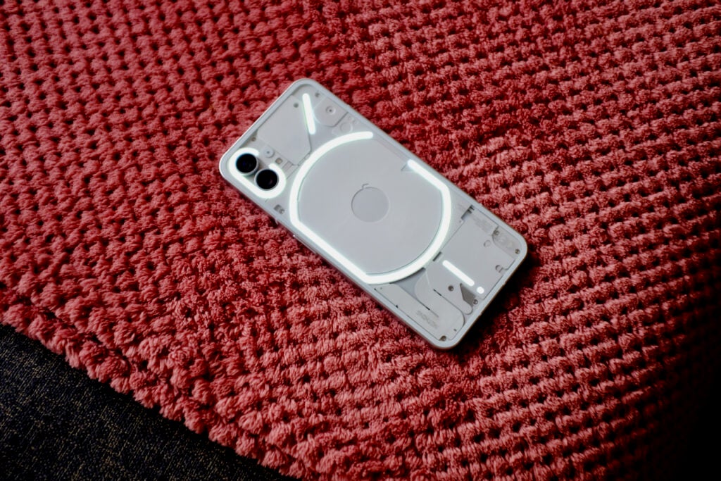
The transparent back also allows the phone’s main ‘feature’ – the Glyph Interface – to function.
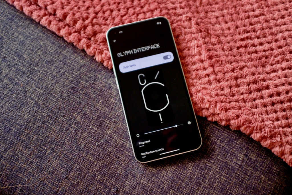
Packed inside the phone are a series of bright, white LED light strips that act as a – to put it as simply as possible – flashy notification system. The arrangement of LEDs flash when a notification comes in and a strip towards the bottom fills up as the phone charges. The Glyph lights can also give you a softer hue when you’re recording video.
It’s a design feature so distinctive that Nothing also opted to use the system on the newer Nothing Phone (2).
It’s a clever trick, at least for the first couple of hours of use, but sadly it just eventually turned into a gimmick I could have done without.
The LEDs light up when notifications come in and the phone is placed screen-side-down. You can manually tweak the rhythm of the lights and Nothing has crafted a whole bunch of special ringtones that sound in time to the LEDs. The look is clever and unique, but I eventually found the constant light show more of an irritant than a benefit.
I still really like the bottom LED that slowly fills up as the phone charges giving you a visual indicator of how close you are to 100% without getting distracted by the phone itself.
Things are improved somewhat on the newer Nothing Phone (2) with brighter LEDs and automatic brightness adjustment, more LEDs for finer control of the light show and new features like a timer and the ability to check the status of apps like Uber and Deliveroo by glancing at the Glyph, but it’s still not expansive.
Glyph aside, the Nothing Phone (1) looks, and feels, very much like an iPhone 13. The sides are flat, as is the front and back, while a duo of cameras sit towards the top of the rear. The Nothing Phone (1) looks so much like an unorthodox iPhone 13 that my partner thought it was Apple’s next device when she picked it up for the first time.
Nothing says the Phone (1) is made from 100% recycled aluminium, with 50% of the plastic components coming from ‘bio-based and recycled sources’.
The aluminium frame is light and has so far offered good levels of durability, something backed up by the Gorilla Glass coverings. The comparison to the iPhone 13 is, of course, far from a knock against the Nothing Phone (1). It’s a good-looking device, and while it would have been nice to see an IP68 rating for added water resistance, that’s a feature we rarely see at this £399 price.
We’re also far from guaranteed a top-end display at this price but Nothing has at least decided against skimping on the screen – a move I will always commend. There’s a 1080p HDR10+ capable 6.55-inch OLED here, with a smooth 120Hz refresh rate and 240Hz touch sampling rate for responsive gaming controls. Considering Google’s Pixel 6a has a mere 60Hz display, Nothing has a notable one-up on one of its bigger rivals.
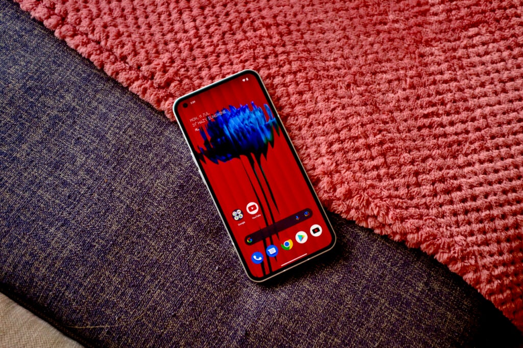
Unlike some pricier phones, the 120Hz refresh rate only switches that top number and 60Hz, rather than down to as low as 1Hz. This is known as a variable refresh rate screen, and it can save battery by working the screen less in situations that aren’t as demanding. It’s a feature of the newer Nothing Phone (2) if that’s of importance to you.
I fired up some HDR videos on YouTube and they popped with brightness, while the screen can hit just under 500 nits of brightness in everyday use. This is enough to cope with brighter days and the Nothing Phone (1) managed to avoid becoming unusable in direct sunlight.
Inside the display is a reliable fingerprint sensor for biometric unlocking and instead of a notch, there’s a small cutout in the top left corner for the front camera.
Camera
- Two rear cameras, with the main sensor being the best
- Good 16MP selfie camera
I wasn’t expecting much from the photography skills of the Nothing Phone (1). Too often affordable devices have promised a lot and then disappointed when it comes to optics – I am looking at you OnePlus. But in reality, the experience here is strong for the price. The main camera churns out great daylight snaps and the ultrawide is there for a bit of versatility.
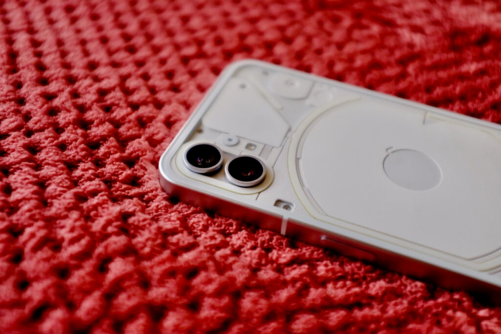
There’s a duo of 50MP sensors on the back, with the main camera being a Sony IMX766 sensor toting OIS (optical image stabilisation). Around the front, there’s a 16MP sensor.
The camera specs sound good on paper as this is the same sensor you’ll find on excellent smartphones like the Oppo Find X5 Pro and Xiaomi 12, which really impressed us when we tested them. It also thoroughly impressed our reviewer of the OnePlus Nord 2T, another phone that uses this sensor.
I’ve been shooting with the Phone (1) for over a week at this point and I feel I can trust the camera to snap a good picture in most conditions. Of course, the highlight is in well-lit situations where the snaps taken from the phone are bright, colourful and detailed.
A good test of a camera I always find is snapping a pic of my dog and seeing whether the phone can pull enough detail out of the fur without resorting to heavy sharpening in post-processing. The Nothing Phone (1) does a good job here, presenting a clear image with good fur detail without looking too processed.

On another day of testing, I took the phone out when the sun was bright and this showed some of the phone’s issues with HDR photography. Often images were way over-exposed and I didn’t feel like the software was doing enough to counteract the rays. Still, the majority of shots I took were usable.

Images are still good when the lights go down, with the night mode pulling some extra brightness out of scenes where movement is kept to a minimum. I’d still say the Pixel 5a captures better night shots, but the Nothing Phone (1) does a commendable job.
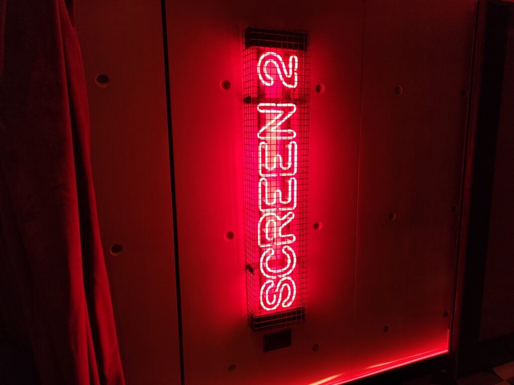
The results were less impressive with the secondary ultrawide lens. The colours are very different when you switch and the end product is a bit disappointing. Still, I like the addition of this focal length and it can still produce some nice images.

Nothing has to be commended for not adding an extra terrible telephoto sensor or a pointless macro sensor here just for marketing purposes. Yes, a true telephoto camera would have been nice, but I have yet to use a phone at this price that can do zoomed images justice.
Video doesn’t seem to have been much of a focus for Nothing here, as the feature-set is minimal. You can shoot in 4K up to 60fps with a fairly standard level of stabilisation and that’s about it.
For reference, the newer Nothing Phone (2) sports an identical dual-50MP camera setup, though with a different main sensor and an improved ISP that can capture much more data – though whether this results in notably better results is yet to be seen.
Performance
- Less of a focus on specs than much of the competition – which isn’t a bad thing
- The Snapdragon 778G+ chip is capable
- Some performance issues, likely down to software optimisation
Unlike OnePlus, Nothing isn’t touting the Phone (1) as a flagship in terms of performance. In fact, the spec list here is very modest. If a top-tier Qualcomm chipset or ridiculously fast charging is a must-have feature, you might be better off looking at something from Realme or Xiaomi – or even the newer Nothing Phone (2).
With that said, what is on offer with the Nothing Phone (1) is more than enough for most users. RAM comes in either 8 or 12GB sizes, while the mid-range Snapdragon 778G+ chip has been tweaked especially for Nothing thanks to the addition of both wireless, and reverse wireless charging.
There’s 5G – a feature you’ll find on more and more phones even at this price – though there is no mmWave support.
I’ve had some mixed results with the performance of this phone, though I don’t really see the chipset as the main culprit. I’ve run into many instances of stuttering, notably when scrolling around the home screens and especially inside the camera app. The whole shooting experience is slow, with frames dropping when I’m taking a photo and frequent drops to black when I switch between modes.
However, in benchmark tests and gaming the phone delivers the results I would expect at this price point. It can handle long bouts of Call of Duty Mobile without getting hot and when I am in apps the performance is steady.
I would say the issues I have experienced are down to software optimisation, something not unusual for a new brand creating its first phone. It does lead to an often frustrating experience though.
Call quality, Wi-Fi performance and cellular connectivity are all good and the 8GB RAM in my review unit is more than enough for a day’s worth of apps to stay in memory.
The Nothing Phone (1) runs Android 12 with a promised three years of software updates, however, as the company is new we’re yet to really see how quickly it delivers these updates. Nothing OS sits atop Android 12 and it is a very minimal coating so hopefully they’ll come quickly, but only time will tell.
There are some new wallpapers, liberal use of Nothing’s dot-matrix font and a slightly tweaked quick settings bar. There are also a couple of new widgets, including an NFT Gallery and one to pair with a Tesla. I can’t help but think Nothing is hoping its prospective buyers are also the sort who would buy a Tesla.
I like the clean look of the UI and appreciate the complete lack of bloatware installed. However to call this an OS is pushing it. Really it’s a very light skin where all the best bits have been designed by Google.
Things have been improved with the Android 13-based Nothing OS 2.0 on the Nothing Phone (2), however, and Nothing has promised that the update will hit the Nothing Phone (1) in the coming months.
Battery Life
- Wireless charging is great to see at this price
- No boxed charger included
Inside the Phone (1) is a 4500mAh battery and during my time with the phone, it has never failed to get me through the day. Particularly busy days have called for the lowering of the screen to 60Hz, but for the most part, this is a device you won’t be worrying about charging before you leave the office. However, the phone doesn’t last quite as long as the OnePlus Nord 2T – so that’s probably a better choice if you’re keen on getting as much juice from a charge as possible.
Standby times are oddly poor, far worse than what I would usually expect from an Android phone at this price. Leaving the phone unplugged overnight saw it drop by 15% four nights in a row. Like the slow cameras, there’s every chance this could be a result of poorly optimised software.
Nothing has run with the example set by Apple and Samsung and not included a charger in the box, though it hasn’t matched the Xperia 1 IV by removing the USB-C cable. The phone is capable of 33w fast charging, so pick up a plug capable of at least that speed if you’re shopping around. A full charge takes roughly an hour, which isn’t as good as the 37 minutes it took to charge the Realme GT Neo 3T but still faster than charging an iPhone 13.
It’s great to see Qi wireless charging here too, a feature rarely seen at this price. There’s even reversible wireless charging, so you can charge a pair of Qi earbuds on the back at 5w.
Latest deals
Should you buy it?
You want a phone that catches the eye: The Nothing Phone (1) does have a unique look, with the transparent back and the Glyph UI. It certainly catches the eye and stands out.
You’re after a top performing device: I noticed multiple performance issues with the phone, from the slow camera to general issues throughout.
Final Thoughts
Even compared to the newer Nothing Phone (2), the Nothing Phone (1) is a good affordable Android phone. For £399 you’re getting a nice screen, versatile camera, a day-long battery and a unique design. Compared to the £579 asking price of the similar-looking Nothing Phone (2), it’s a steal.
However, nothing really stands out here as being better than what was already on the market. The Pixel A series takes nicer photos, the OnePlus Nord 2T is a better performer and the Realme GT Neo 3T charges faster.
At least the Nothing Phone (1) is a good all-rounder and for many, that’ll be enough, especially when it’s paired with a neat design that’ll certainly get people talking.
How we test
We test every mobile phone we review thoroughly. We use industry standard tests to compare features properly and we use the phone as our main device over the review period. We’ll always tell you what we find and we never, ever, accept money to review a product.
Used as our main handset during test period
Camera tested in variety of situations with all modes
Tested with synthetic benchmarks and real world use
FAQs
There is no charger included here, just a USB-C cable. The phone does support 33w charging (along with Qi wireless charging) so it’s worth picking up a charger that supports those speeds.
There is not a case included, however Nothing is selling a case that shows off the Glyph interface.
It is promising three years of big Android updates and a further one of security updates. That’s good for this end of the market.
Trusted Reviews test data
Full specs
Sustainability
TrustedReviews’ holds the fact that global warming is not a myth as a core value and will continuously endeavor to help protect our planet from harm in its business practices.
As part of this mission, whenever we review a product we send the company a series of questions to help us gauge and make transparent the impact the device has on the environment.
We currently haven’t received answers to the questions on this product, but will update this page the moment we do. You can see a detailed breakdown of the questions we ask and why in our sustainability info page.

